
Video: How to Choose the Colours of Your Walls *Currently 60 views
Choose the Right Paint Colours for Your Walls
Are you planning to paint the walls of your house?
If you intend to sell your home soon, it is a good idea to paint your walls white or off-white. This gives a clean, bright feel and enables the next owners to add whatever colour they fancy.
What if, though, you want just the right colour for the walls of your home, to enjoy and live in?
As there are a myriad of colours to choose from, there are many ways to help you choose the right colour to paint the walls of your home.
Colour Has Meaning
Colour is linked with memory, perception, and emotion. For sighted people, it’s how we perceive and interpret the world.
Nature is awash with colour.
Think of a bright blue sky, green forest, yellow sun, and red berries.
Colour has cultural connotations:
- Purple for luxury or spirituality
- Blue for peace and dependability
- Yellow for happiness and fun
- Green for nature and abundance,
- Red for passion or anger
Colours can be cool, like blues, greens, and purples, or warm, like reds, yellows, and oranges.
Colour can be bright and intense, or muted and dark.
With so many meanings, how do you choose the right colours?

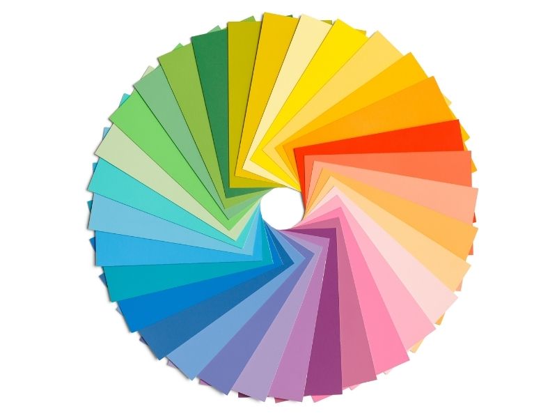
Colour Basics
Do you remember the colour wheel from school?
You know, the primary colours – blue, red, yellow.
Then the secondary colours of green, purple and orange, and all the colours and combinations in between.
It was pretty simple, wasn’t it?
Well, colour selection IS simple, in essence. But it certainly can seem complicated!
Key Elements of Colour
Choosing the right colours for your walls can be broken down into 4 key elements. These are:
- Temperature
- Tone
- Hue
- Chroma
Temperature
We’ve already mentioned cool and warm colours.
Choosing a certain colour’s temperature affects the mood of a room, and how it is perceived or experienced.
If you think of colours with a ‘warm’ temperature, reds, oranges and yellows, it’s because they are associated with things like fire, sunshine, and heat. Warm colours can also be energetic, playful, and full of life.
If you want a warm, inviting feel, you might choose warm colours.
On the other hand, perhaps the look and feel you are going for is designed to evoke the soothing sense of water, or grass. In this case, you might consider lower temperature colours like blues and greens.
Cooler colours tend to be less harsh on the eye and may give you a feeling of larger space within the room.
Cool colours are generally more suitable to warmer regions.
Painting with cool colours such as blues, greens and purples makes small rooms appear larger and airier.
Green, for example, is a calming, cool colour great for bedrooms and bathrooms.
Warm colours, such as reds, yellows and oranges will give a room a more vibrant appearance. These colours are more acceptable to cooler climates.
Tone
The tone of a colour refers to its lightness or darkness. If you recall mixing paint in primary school, black added to colour makes it darker (tone), while adding white makes it whiter and paler (tint).
Choosing lighter paint colours such as blues, lavenders, pinks and soft yellows are suitable for a romantic feeling of tranquility and restfulness in a room.
If you are going for a feel of calm ambience, choose lighter shades of either cool or warm colours.
White evokes peace, purity, and intellect. White suits office spaces, for example, and areas where you need to think.
Hue
Hue is just another word for colour.
Hue is the foundation of your colour scheme.
Hues can be Primary colours (red, blue and yellow).
Hues can also be Secondary colours (mixes of two primary colours) or tertiary colours (combinations of primary and secondary colours).
If you plan to use mainly whites for your walls, choose cool whites and neutral colours.
Choose warmer whites that can brighten up darker or south facing rooms.
Neutral colours can provide a sense of elegance and flexibility.
Don’t just think of neutral colours as simply white or beige.
You can add favourite colours into neutral white shades of paint to give them a lift. These can add a distinct accent or flavour to a room, such as warm and cosy or cool and muted.
Conventional wisdom is that small, dark rooms should be painted white to maximise the feeling of space. However, this doesn’t always work out.
If there’s not much natural light reaching the room, applying a whitewash can make it look even more dim, grey and depressing.
You can create a feeling of warmth and elegance by selecting varying shades of neutral colours such as pale walls with a hint of tan or brown, with trims of terracotta browns.
Blacks and browns are grounding colours and can be used in varying shades throughout your home.
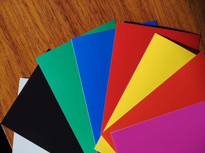
Chroma
Chroma refers to the strength, or intensity of the colour.
Chroma colours are bold and stand out.
These bold chroma colours work best for feature walls, or doors that are a focal point in the room.
Bold colours can be complementary by contrasting two next to each other like gold or orange, and one from the opposite side of the colour wheel such as purple.
You can also select black and red for a standout contrast and look of the far East.
Tips for Choosing Colours
Look around at the décor of a room.
Look at features like curtains, rugs, drapery, tiles, tablecloths, throw pillows or bedding.
Consider the colours of any artwork in the room. If there is a colour theme there, consider painting your walls in a similar colour, or complimentary colours.
You should avoid going for too close a match up with your decor.
Colour co-ordinating can look boring and washed out. If you select a much lighter or darker colour than the pre-existing elements of a room, this will be more effective.
Look within nature for inspiration.
Think about the laid-back blues of the ocean, dusky purples of a mountain range, pale warmth of beach sand, and greens of the surrounding foliage.
Another source of inspiration is from catalogues, magazines, and fabric swatches.
Look at other houses, other walls, and decide which you like and dislike.
Sometimes the hardest part of choosing a paint colour is having too many options!
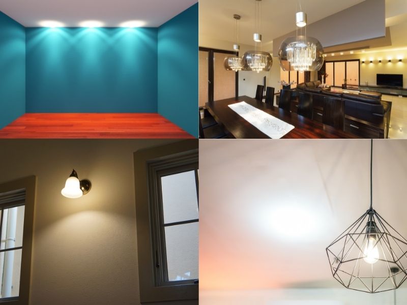
Room Lighting can Affect Colour Choices
If a room or space receives little natural light, consider lightening it up with a light, cool colour.
A room that receives a lot of sunlight might benefit from being painted with a deeper, richer colour.
On the other hand, a dark colour may create a stand-out feature wall, but without natural light, it may end up looking dull and depressing.
Natural light is always best to see how a colour really looks.
Incandescent lighting brings out warm tones while fluorescent lighting brings out blues. Before selecting any paint colours, ensure you get your lighting right.
Colours to Suit Spaces
For areas with lots of activity, traffic, and stimulation, such as a games room, think about using warm colours.
Rooms that require calmness and contemplation, such as a bedroom or reading room, favour the use of cool colours.
Sample Your Colours First
Before you commit to using a certain colour, always get a sample.
When you are committing litres and litres of paint and several hours to painting your house, you have to get the colour right the first time.
Don’t rely just on sample swatches.
Always test the colour directly on the wall. This will give a real sense of what the paint colour will look like.
Try this technique to avoid painting directly on the wall.
- Get some sample pots to paint each of four to five colours you’ve chosen onto a sheet of white A3 card.
- You may need a couple of coats of paint, depending on the depth of your new colour choice.
- Place the swatches on walls with ‘blu tack’ or tape around the room.
- Leave the colour on the wall for a day or two.
- Observe how the light affects it, including shadows and bright reflections at different times.
- You should be able to see the effect of sunlight and artificial light on the colours you have chosen.
This will help you to narrow down your choice to one or two colours or tones at most.
Flow Colours Throughout Your Home
If you’re painting a small home, consider extending, or flowing the colour throughout the rooms.
This can give the illusion of a larger space.
An effective way to use flowing colour is to choose a neutral paint colour that will be your signature hue for your home.
Each room you paint can then have their accent colours, or you can use the same accent colours in different amounts in each room.
Colour Matching Apps
Wish there were software solutions to guide your colour choice?
Well, there are.
Fortunately there are smartphone apps like Dulux Colour App, Color 911 or Resene ColourMatch that allow you to snap a hue anywhere and then match it to the closest paint colour. (Once you’ve found the preferred colour, measure the room and check the back of the tin to check how many metres it will cover.)
You could also use a paint simulator, such as this one from British Paints.

Choosing Colour for Impact
Choosing the right paint colour has more impact than you might think.
- Colours can make a small room feel larger, and a large room feel cosier.
- Colours can lighten a dark room, and they can minimize glare in a bright, sunlit space.
- Colours can warm up a chilly north-facing room or create warmth and intimacy in evening light.
We’ve given you several ways and tips to choose the right colours to paint your home.
As always, if this choice is too daunting for you to figure out on your own, ask a professional painter.
For example, at Paintenance Melbourne, we offer a free colour design service at no cost to you (upon acceptance of our quote) to assist in selecting the right colours for your home.
*If you want to talk to us about getting a free quote, call on 0404 227 330.
It’s your choice!
Article references and for further reading and information on this topic:
- How to Choose Paint Colors for your home – Dunn-Edwards Paints
- Colour Basics – Dulux
- Tips for Choosing Interior Paint Colours – The Spruce
- How To Select the Right Paint and Color For Your Home – DIY Network
- 10 things to consider when choosing paint colours – Domain